I was ultimately responsible for every shopper’s experience with our products.
My first design role at eBay was with the Algorithmic Merchandising team. Within a year, I was the design, PM for the UX & Platform tracks, as well as writing production code. After rebuilding our serving platform and templates, my team and I created a set of products that would engage users with new types of recommendations and drive increased revenue.
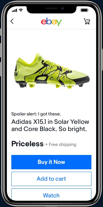
A few years ago, I was hunting for some soccer cleats. I knew the brand. I knew the model. I knew the size. But which garish colorway was the right one for me?
We know this is a common pattern at eBay. Users search for something, then to bounce between search and item pages, while playing with filters and keywords trying to find the perfect item. Rather than try to completely change this behavior, we chose to work within the behavior pattern users already have – just making it more efficient.
Our First Problem
eBay never really knows why a user clicks on an item.
We can infer it based on filters and search terms, but at the end of the day, eBay doesn’t know if I searched for Adidas because I love Adidas shoes or it’s just the first brand I thought of.
Our first few attempts focused on identifying the top aspect (Brand) & value (Adidas) pairs of an item and grouping either by variation on a single aspect or providing a single value for multiple top aspects.
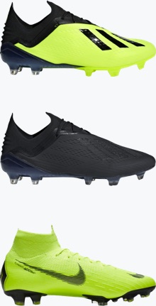
Tests showed we didn’t have enough of the right data. There was good news: where the data existed, performance was good enough for us to continue iterating over time.
Getting It Right
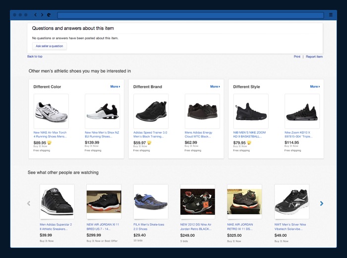
For our second attempt, we waited until this data was mandated for sellers in most categories, and built an algorithm from scratch that reflected our new strategy - focusing on the variety. If you’re looking at black Nike running shoes, we would show suggestions for different brands of black running shoes or different colors of Nike running shoes.
A/B Test Results
8X
Increase in inventory with at least 2 cards, from V1 to V2
60%
Merch-driven revenue, vs production experience
20MS
Reduced response time, vs production experience
Version 3: Mobile First
Breaking the grid in our iOS and Android native apps
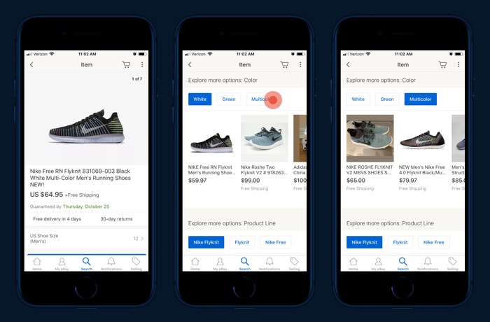
The next step was to provide more options - not just a mixed list of brands or colors, but to actually group them into meaningful sets. We started with mobile, where we were limited to large, stacked grids. We didn’t want to add more items to an already overstuffed page. Once we showed that carousels were a viable alternative, we began exploring ways for users to explore our recommendations.


Mobile Launch
Our first prototype showed 1 or 2 carousels per aspect, with the additional recommendations triggered by the user to enable an infinite browse experience. Unfortunately, this didn’t go far - in development, it turned out to be too slow, too clunky, and too memory intensive.

The final product was much simpler - using a carousel of buttons to switch a carousel of items. This saw boosts to engagement and performance on par with the very first launch on desktop.
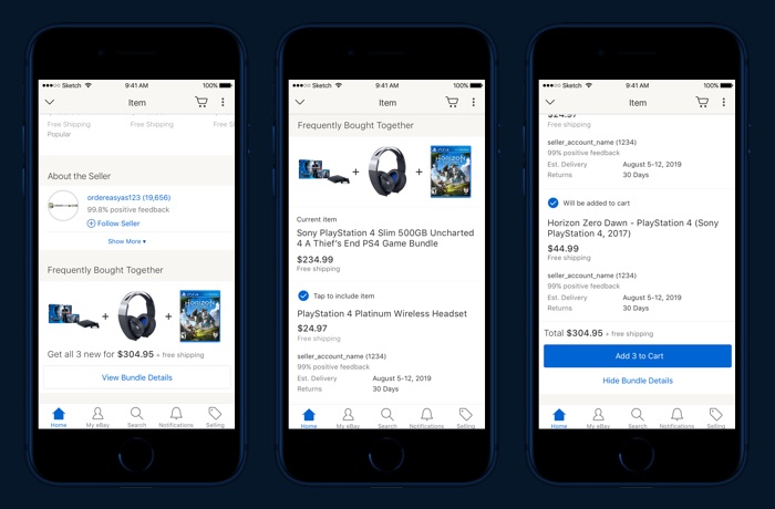
The basic UI requirements of a bundling product have been stable for years - select and deselect 2 to 3 items, and add them to your cart with a single click.
What we didn’t know was, “What do users actually want from bundling? What will help them trust this feature if we build it on eBay?”
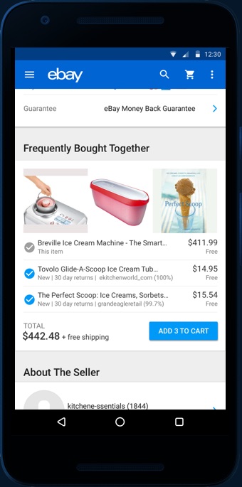
Research Session 1
Discover our users’ basic needs and wants.
With our first set of users, we focused on core questions about what they expected from a bundling product. We asked about price relationships, accessories vs co-purchases, intrinsic benefits, and compatibility.
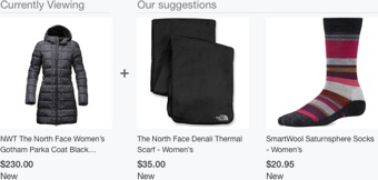
The primary takeaway was that this is an impulse purchase driver. While many shopping decisions are situational, the core product has to be based around minimal resistance.

The bundles items needed to have relatively low incremental cost, obvious compatibility, and some perceived benefit - even just having items arrive around the same time. Anything that ads the slightest friction to this process results in it being ignored.
Research Session 2
Let’s complicate matters. What could go wrong?
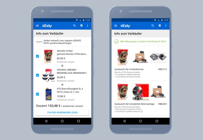
In our second session, we asked German users about bundle customization - in case our bundle was good, but not perfect. How would users switch or select items? How would they choose between multiple task-based bundles? To make it harder, we focused on automotive items where fitment and compatibility is critical. It’s important to understand our users’ mindsets: Our German users are sterotypically particular, and auto parts can be a case were a wrong part is not just an annoyance, but potentially causes a signficant financial loss or injury (or worse).
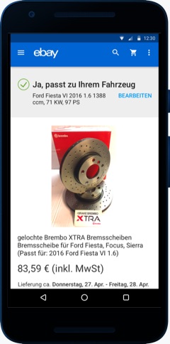
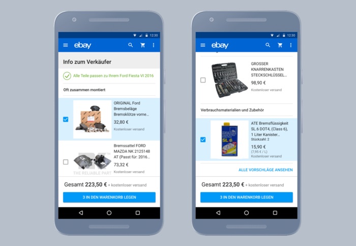
The End Result
My final deliverable was a UI that would provide a place for our developers to work on an algorithm that would balance their data models with the information gleaned from these tests. One version would display the information inline. Another would display the bundle details in a new screen, should the amount of information needed for customer trust become unwieldy.
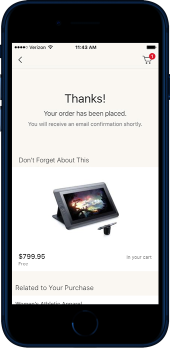
The first priority of eBay’s post-purchase experience is to confirm your purchase. Otherwise, if the user is going to stay on eBay, our priority is to give our users direction to their next purchase. Yes, the user can begin a new search – what if they don’t already have something in mind?
Evaluating a User’s Actions
People are more than their last purchase.
The most important content derives from a simple reminder – if you’re already expressed strong interest in an item (but haven’t bought it or something similar) we offer a reminder.
From there, we begin recommending items complementary to the item(s) you just purchased, our next most relevant key. Then we dig into past history – previously lost items, purchased, or watched items, before looking at browsing history. We tested UI options and content combinations, prior to settling on a set of recommendations that would be triggered based on user behavior, arranged by relevance and rarity.
This set of placements delivered measurable sitewide sales increases - something we’d never been able to say before about the post-checkout experience.
