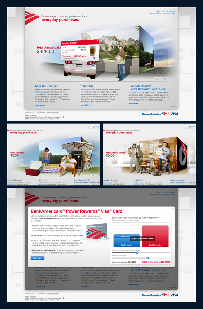
Mockups, including alternate navigation patterns, for path selection and user interactivity
As part of Bank of America's vision of the future, Organic designed a Microsoft Surface experience for visitors to several flagship locations. The goal was to educate users in short, fun, and interactive ways while they waited to speak with an associate.

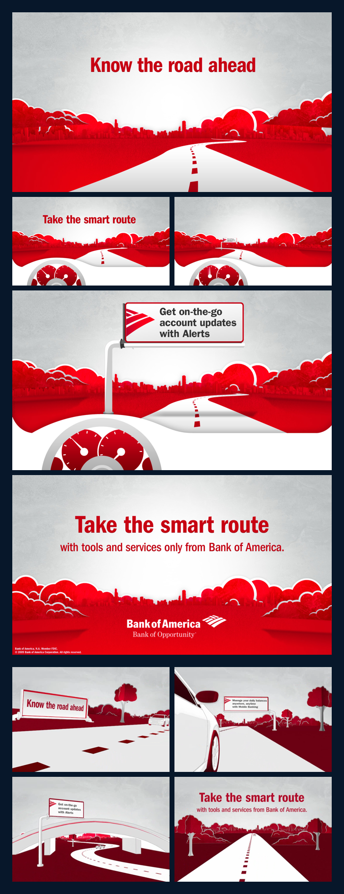
Art direction stills and rendered video frames
To comply with new regulations, Bank of America asked Organic to crate a video piece notifying customers that changes were coming to their pricing and fee structures.

Bank of America Enterprise site design and art direction
Bank of America was looking for a way to organize and promote their enterprise-level content: thought leadership, policy commentary, investor relations, and other high-level corporate iformation. I worked to create a unique set of interaction and visual designs that could move this site beyond the Bank's normal way of thinking about the web.

Microsite design, art direction and video direction
Get More was one of Bank of America's large, semi-annual integrated campaigns. Working with traditional agencies, POS, direct mail, and others, we worked to integrate the "Get More" concept into a video-rich microsite, rich media ads and standard banners that explained how the Bank's offerings helped their customers "get more."